Intellectual property, copyright & copyleft

symbols, images and names which fall in the category of creative works.
Patents, trademarks and copyright are what protects intellectual property in law, and this allows people to benefit in recognition or financially from the creations.
Holding access to only the source code does not imply that the code is open source. The question is what a person is capable of doing with the code. There are a few factors that are offered by the Open Source Initiative that includes free redistribution which must provide source code to make it available. The second factor is that the programme is required to include the source code or either make sure that it is available. This mainly what open source code is about without the source code there would be no benefits to having an open source. The third factor is to allow modifications and derived works. The integrity of the author’s code must be maintained. The other factors link together which suggest to not discriminate against persons or groups and do not discriminate against fields of endeavour.
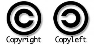
Copyright is the primary type of intellectual property; it enables the copyright owner to protect his or her work against other people from trying to copy their work or claim other people’s work as theirs.
On the other hand, Copyleft is a licence that tries to gain the public the freedom to change, extend and redistribute creative work while it remains free.
Accessibility for Web Design

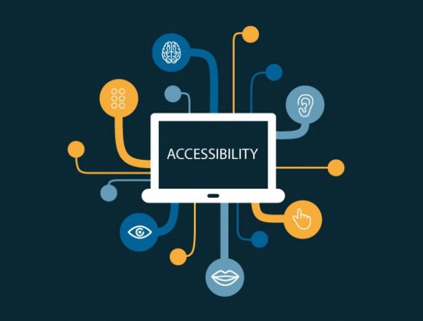
For designers, it is important to consider everyone when creating a website, you must think about how everyone is different and maybe trying to achieve the same goals. People with disabilities should be able to navigate and understand websites. It is considered not to be challenging to create an accessible website.
Accessibility could also include making sure that the site is available to use on mobile and tablet is the correct size and resolution and fits all text and images.
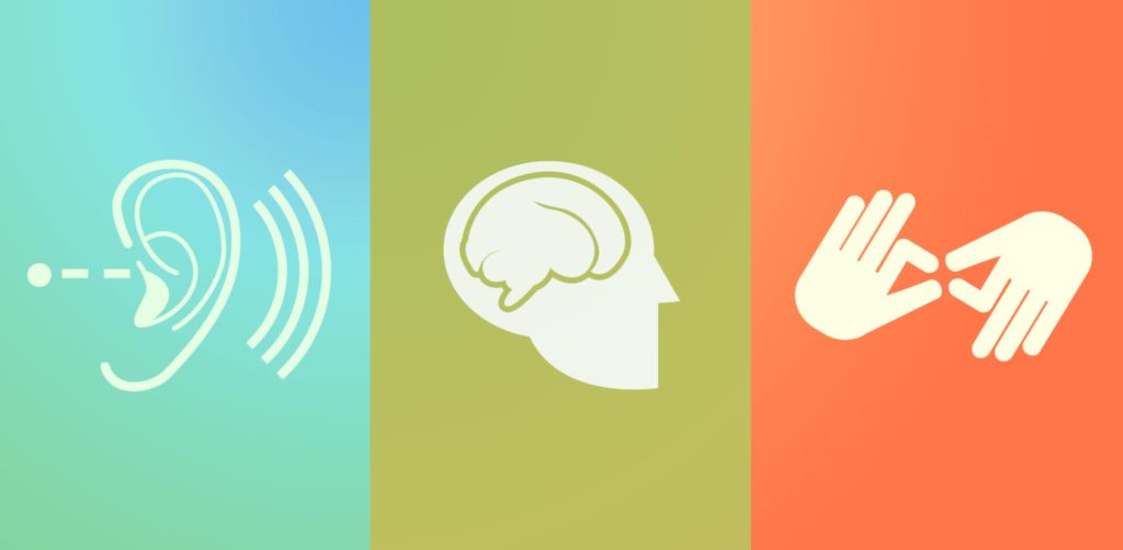
We use colour to communicate status and helps differentiate one thing from the other. Designers should use colour as an advantage but should also make sure that they do not rely on colour when designing. The alternative could be to make the use of shapes and symbols which can make it extra easy for users to understand. When we look at websites, there are accessible websites that not only showcase the colour but also include the colour name; this allows people that are colour blind use their sites independently with ease.
Including small concepts like subtitles when there is sound being played, for people with hearing difficulties is also a way that can make a website accessible.
Making designs that are not only based around colour makes it easier for the people that have low vision or cannot see at all this can help many people. Designers need to be able to convey the same message to everyone by using different methods. Some websites are unable to send the same message to everyone, which could cause them to lose their clients.

Web fonts and Google fonts

 HTML is used to give meaning to the content that is visible on the browser. CSS is the style which includes the aesthetics, colours and fonts. JavaScript can add interactivity to any webpage; an example of this is a calendar or a map. HTML5 is known as the latest version of HTML more support for media elements is integrated; the Canvas element is added; this allows ways to draw graphics using code. 

HTML Terminology 

  • Elements: components examples include links and paragraphs.
  • Tags: Used to specify elements using brackets.
  • attributes: used to give further information 

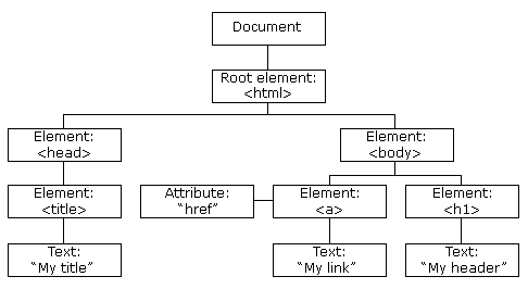
Document object model :

Fonts for the web should be chosen carefully; the maximum number of fonts that should be used is two, and the font should be easy to read. There are no limitations with only using web safe fonts that can be preinstalled on devices, have limited options and the users have no control over what the users have installed. Web fonts do not need to be installed on devices. The web font generator is free and has licences for usage. Google fonts have a wide selection of fonts to choose from and have different categories to narrow down the search process. 

The font family properties define the font and are used to group fonts; two different font family names are available, which are ‘family name’ and ‘generic family.’ 

CSS: Advanced Layouts with Grid

CSS stands for Cascading Style sheets; we know that HTML is used to form the structure of the website; CSS plays its role as the style of the website.
The primary content of CSS is the grid container is elements that are set to grid you can have more than one, and it can be placed inside another Grid items are automatically placed. Gridlines are referenced using numbers which both start and end with borders. A grid cell is the same as a table cell; it is the area that is between the column and row. The grid track is the area that is between two close grid lines. The grid area can cover more than one cell; this is the area that is between four grid lines. A grid-gap known as the gutter is the space that is in between the grid tracks.
With CSS, we now work outside in we start with the grid this requires us to think about the relationships that are between the different content. The point of CSS grid is to work with semantic and HTML markup. Another CSS feature includes an accurate grid which suggests there are no strict grids and columns it is required to think about how the width of the cell will affect the length. The CSS grid features suggest that any grid item can be placed in any space on the grid, the items are stacked according to the HTML source order.
To start stacking the content as a three-column to do this by defining a grid as the primary container.

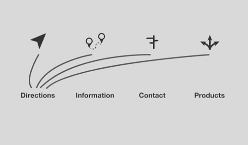
Elements of navigation

When building a website for your visitors, you need to know who your audience is and provide them with the information that they are interested in. When designing a great user experience, the behaviours of the visitors should be considered. To make sure that the website reaches a suitable audience, it is worth thinking about the values, goals, concerns and attributes of the visitors. By giving your site a focus, it makes it the website enjoyable for the users.

When people use websites, it is most likely that they are finding information, and everyone has a set objective when they go on the web. There is only a small percentage of people that end up directly on a web page by using the URL code the majority of people follow links or find the website on a search engine.

A website should be simple and easy to use because of the one clear goal that viewers are trying to achieve is be able to quickly and easily use the website. An example of how designers can achieve this is by making sure the images that they use explain the content and are relevant. Advertisements that play on a page should be appropriate in the way that they relate to the information on the page. When designing for web, there should be a mix of media which includes text, images and videos. To analyse if a website is easy to use the content should all be helpful and relevant.

Design Aesthetics for the Web

Aesthetics is an area that practitioners study beauty due to it relating to art. In graphic design, aesthetics is related to the cohesion and vision of work. Good designs can signify a meaningful design which has useful components. Design aesthetics are moving forward, including the other senses such as touch and sound.

Web design should be compatible with other operating systems such as mobile and tablets. Design is crucial; it can determine whether you have a positive or negative experience with a website.  Design influences everything and is everywhere; it can be seen in wallpaper or a book cover.

The elements of design are the elements that are required in creating a design. The eight elements of design include colour, value, shape, texture, form, line, space, type. These elements are required in creating a design.

When designers are designing for the web, they need to consider the user’s experience. According to the Nielsen Norman group examination, there is evidence that suggests users view the website in an F -shape this indicates that the important information should be quick and straightforward to read as the evidence suggests the readers skim through the text. Images should also be included to grab the viewer’s attention. When it comes to typography, there is a maximum of two fonts that should be used, and the font must be readable so that the viewers can quickly skim what is written. The colour palette that you choose for your website should be appropriate to the client’s needs.